
Faceland · Information architecture · Netherlands
The site was organised by product. Patients navigate by body part.
The site was organised by product. Patients navigate by body part.
A research sprint that rebuilt the navigation of the Netherlands’ largest cosmetic clinic group around concerns instead of product categories, and proved the new structure worked before the development agency wrote a line of code.
Faceland · Information architecture · Netherlands
The site was organised by product. Patients navigate by body part.
A research sprint that rebuilt the navigation of the Netherlands’ largest cosmetic clinic group around concerns instead of product categories, and proved the new structure worked before the development agency wrote a line of code.

ROLE
Product Designer. Research, IA, interface.
Product Designer. Research, IA, interface.
TEAM
Me and a UXR intern under my supervision.
Me and a UXR intern under my supervision.
TIMELINE
10 weeks, Q1–Q2 2026.
10 weeks, Q1–Q2 2026.
METHODS
Survey (n=102), interviews (n=4), tree test (n=73).
Survey (n=102), interviews (n=4), tree test (n=73).
REPORTED TO
Head of Digital Marketing and CMO.
Head of Digital Marketing and CMO.
PROJECT SUMMARY
The 60-second version
The 60-second version
CONTEXT
Faceland is the largest cosmetic clinic group in the Netherlands: 28 clinics, 40+ treatments, a full platform rebuild underway with an external development agency. The navigation was organised the way the company is organised, by product category.
THE PROBLEM
Nobody could answer how patients actually look for a treatment, and the agency was weeks away from building an architecture out of internal assumptions. IA is the one decision you cannot cheaply reverse after launch.
OUTCOME
The concern-led structure (new) beat the live navigation on every primary metric across 4 of 5 shared tasks. It was signed off by the CMO as the confirmed architecture for the rebuild and handed to the agency with the evidence base and a page-level template.
MY ROLE
Ran a mixed-methods discovery sprint, used it to rebuild the IA around body zones and concerns, then validated the new structure against the live one in a between-subjects tree test with 73 Dutch participants recruited off-panel.
90.5%
Found target in 3 clicks or fewer
Against 27.3%. Success without backtracking.
+31pp
Task success, hardest task
Task success, hardest task
60.0% against 28.9% in the live structure (p = 0.008).
60.0% against 28.9% in the live structure (p = 0.008).
Median time on task
2× faster
Roughly half the completion time on 4 out of 5 tasks.
90.5%
Found target in 3 clicks or fewer
Found target in 3 clicks or fewer
Against 27.3%. Success without backtracking.
Against 27.3%. Success without backtracking.
2× faster
Median time on task
Median time on task
Roughly half the completion time on 4 of 5 tasks.
Roughly half the completion time on 4 of 5 tasks.
PROJECT SUMMARY
The 60-second version
CONTEXT
Faceland is the largest cosmetic clinic group in the Netherlands: 28 clinics, 40+ treatments, a full platform rebuild underway with an external development agency. The navigation was organised the way the company is organised, by product category.
THE PROBLEM
Nobody could answer how patients actually look for a treatment, and the agency was weeks away from building an architecture out of internal assumptions. IA is the one decision you cannot cheaply reverse after launch.
OUTCOME
The concern-led structure (new) beat the live navigation on every primary metric across 4 of 5 shared tasks. It was signed off by the CMO as the confirmed architecture for the rebuild and handed to the agency with the evidence base and a page-level template.
MY ROLE
Ran a mixed-methods discovery sprint, used it to rebuild the IA around body zones and concerns, then validated the new structure against the live one in a between-subjects tree test with 73 Dutch participants recruited off-panel.
90.5%
Found target in 3 clicks or fewer
Against 27.3%. Success without backtracking.
+31pp
Task success, hardest task
60.0% against 28.9% in the live structure (p = 0.008).
Median time on task
2× faster
Roughly half the completion time on 4 out of 5 tasks.
90.5%
Found target in 3 clicks or fewer
Against 27.3%. Success without backtracking.
2× faster
Median time on task
Roughly half the completion time on 4 of 5 tasks.
01 - The problem
We understood our treatments. But not how patients decide to book one.
We understood our treatments. But not how patients decide to book one.
Faceland’s navigation asked every visitor a question they could not answer: do you want a muscle relaxant, a filler, a skin treatment, or surgery?
That question is trivial for the clinical team and close to unanswerable for a patient. Someone arrives thinking, “my forehead lines make me look angry”, and to get anywhere they first have to translate that into a pharmaceutical category, then a brand name, then a page. 20 fillers sat in a single flat list. Botox and Bocouture, Belotero and MaiLi, were presented as meaningful distinctions to people who had never been given the context to tell them apart.


01 - The problem
We understood our treatments. But not how patients decide to book one.
Faceland’s navigation asked every visitor a question they could not answer: do you want a muscle relaxant, a filler, a skin treatment, or surgery?
That question is trivial for the clinical team and close to unanswerable for a patient. Someone arrives thinking, “my forehead lines make me look angry”, and to get anywhere they first have to translate that into a pharmaceutical category, then a brand name, then a page. 20 fillers sat in a single flat list. Botox and Bocouture, Belotero and MaiLi, were presented as meaningful distinctions to people who had never been given the context to tell them apart.
02 - My Contribution
Understand, restructure, prove.
Understand, restructure, prove.
The hard part was never finding a cleaner way to organise the site. It was proving that structure would hold up once real patients tried to use it.
Understand
The objective was to find the mental model of our customers. We set up a survey to size the barriers across segments and some interviews to explain why they exist.

Old Navigation Bar
Phase 02 : Restructure
Rebuild the tree by body zones as the primary entry, concern language beneath them, product names demoted to a secondary validation layer.
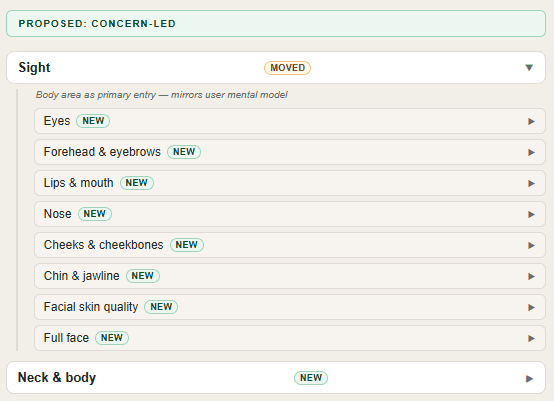
Sneak peak of the new IA
Phase 03 : Validate
Two parallel tree tests, one per structure. Between-subjects and off-panel, so the result measured findability rather than familiarity with the brand.

Tree Test Results
02 - My Contribution
Understand, restructure, prove.
The first two phases are what most IA projects deliver. The third is the one that changes how the decision gets made. It turns a designer’s opinion into a number the CMO can defend. Rephrase this sentence
Understand
The objective was to find the mental model of our customers. We set up a survey to size the barriers across segments and some interviews to explain why they exist.
Old Navigation Bar
Phase 02 : Restructure
Rebuild the tree by body zones as the primary entry, concern language beneath them, product names demoted to a secondary validation layer.
Sneak peak of the new IA
Phase 03 : Validate
Two parallel tree tests, one per structure. Between-subjects and off-panel, so the result measured findability rather than familiarity with the brand.
Tree Test Results
03 - The insight
One insight organised everything else.
One insight organised everything else.
Across 102 survey responses and four interviews, the same structural mismatch kept surfacing: patients think in problems and desired outcomes, and the platform was built around products and categories.
Selection uncertainty
Selection uncertainty, not flow friction, was the number one reason people did not book, named first by every segment, including ten-year customers, which meant the barrier was editorial rather than a checkout problem.
Fear of Large Clinics
Scale read as risk: both prospective patients independently described a high-volume clinic in the same wary vocabulary, which made specialist visibility a structural requirement rather than a page-level nicety.
Anatomical navigational
Every participant navigated anatomically, and not one could distinguish Belotero from MaiLi without clinical help.
Selection uncertainty
Selection uncertainty, not flow friction, was the number one reason people did not book, named first by every segment including ten-year customers, which meant the barrier was editorial rather than a checkout problem.
Fear of Large Clinics
Scale read as risk: both prospective patients independently described a high-volume clinic in the same wary vocabulary, which made specialist visibility a structural requirement rather than a page-level nicety.
Anatomical navigational
Every participant navigated anatomically, and not one could distinguish Belotero from MaiLi without clinical help.
“I’m not satisfied with this part of the body, and then I look further at what the possibilities are.”
R. · customer for 10 years
“I don’t want to think I’m going to a supermarket. I want a real specialist.”
A. · prospective switcher
03 - The insight
One insight organised everything else.
Across 102 survey responses and four interviews, the same structural mismatch kept surfacing: patients think in problems and desired outcomes, and the platform was built around products and categories.
Selection uncertainty
Selection uncertainty, not flow friction, was the number one reason people did not book, named first by every segment, including ten-year customers, which meant the barrier was editorial rather than a checkout problem.
Fear of Large Clinics
Scale read as risk: both prospective patients independently described a high-volume clinic in the same wary vocabulary, which made specialist visibility a structural requirement rather than a page-level nicety.
Anatomical navigational
Every participant navigated anatomically, and not one could distinguish Belotero from MaiLi without clinical help.
Selection uncertainty
Selection uncertainty, not flow friction, was the number one reason people did not book, named first by every segment including ten-year customers, which meant the barrier was editorial rather than a checkout problem.
Fear of Large Clinics
Scale read as risk: both prospective patients independently described a high-volume clinic in the same wary vocabulary, which made specialist visibility a structural requirement rather than a page-level nicety.
Anatomical navigational
Every participant navigated anatomically, and not one could distinguish Belotero from MaiLi without clinical help.
“I’m not satisfied with this part of the body, and then I look further at what the possibilities are.”
R. · customer for 10 years
“I don’t want to think I’m going to a supermarket. I want a real specialist.”
A. · prospective switcher
04 - The new structure
From four product silos to eight anatomical zones.
From four product silos to eight anatomical zones.
I rebuilt the full tree rather than reshuffling labels, then documented every node as moved, new or demoted, so the agency could see exactly what changed and argue with it.
01 - Body areas as primary focus
Body area becomes the primary entry Product names survive as a secondary label on the page, never as the gate that decides whether you can find anything.
02 - Specialist trust is more important that clinic proximity
Specialists promoted out of a dropdown The specialist is the trust filter for new patients and the reason existing ones stay loyal, so they became a top-level destination with photo, experience and BIG registration.
03 - Deals that scream at users don't convert
Deals demoted, and segmented The hardest recommendation to sell internally. Discounts are a retention tool for returning customers and a trust liability for prospective ones, who read low prices as inexperienced practitioners. Same signal, opposite directions. Was: Prominent, visible to everyone
04 - The new structure
From four product silos to eight anatomical zones.
I rebuilt the full tree rather than reshuffling labels, then documented every node as moved, new or demoted, so the agency could see exactly what changed and argue with it.
01 - Body areas as primary focus
Body area becomes the primary entry Product names survive as a secondary label on the page, never as the gate that decides whether you can find anything.
02 - Specialist trust is more important that clinic proximity
Specialists promoted out of a dropdown The specialist is the trust filter for new patients and the reason existing ones stay loyal, so they became a top-level destination with photo, experience and BIG registration.
03 - Deals that scream at users don't convert
Deals demoted, and segmented The hardest recommendation to sell internally. Discounts are a retention tool for returning customers and a trust liability for prospective ones, who read low prices as inexperienced practitioners. Same signal, opposite directions. Was: Prominent, visible to everyone
05 - Proving it worked
A new sitemap is an opinion until you test it.
A new sitemap is an opinion until you test it.
Two tree tests ran in parallel, one on the live structure and one on the proposed one. Text only, no visual design, so the result measured structure and nothing else.
TASK SUCCESS RATE
Current, product-led (n=38)
Proposed, concern-led (n=35)
TASK
CURRENT → PROPOSED
CHANGE
SIGNIFICANCE
Lip flip · cross-product task
+31pp
p = 0.008
Wangen · facial volume
+24pp
p = 0.023
Migraine · functional concern
+18pp
p = 0.032
Ogen · the outlier
Ogen · the outlier
+6pp
p = 0.598
Task success rate, two-proportion z-test. A fifth shared task (finding a specialist) improved 15pp at p = 0.082.
3 vs 9
Median nodes clicked to succeed on the lip flip task.
88.6%
Opened the correct branch on their first click, against 31.6% in the live structure.
< €500
Total cost of validating the new IA, start to reported findings in under two weeks.
The first-click number is the one I care about most. In the live structure the lip flip task split participants almost exactly in half: 34% opened Fillers, 32% opened Spierontspanners. Nothing in a product-led (old) navigation tells you whether a lip shape concern is a filler or a muscle relaxant, so the structure was asking people to guess. Grouping both options under Lippen & mond removes the decision instead of explaining it.
06 - What it becomes
The zone page, built from the findings.
The zone page, built from the findings.
An architecture is abstract until someone sees the page it produces. I designed the eye zone page as the reference template for the agency, with every significant decision traceable to a finding.

New Hero Section
Concern first, product name second
Gezicht (Face)→ Ogen (Eyes). The breadcrumb is the architecture made visible, and the primary action is a consultation rather than a treatment booking.

Specialist selection, with style, experience and BIG registration.
Specialists get a stage, not a dropdown
Two interviewees assess a practitioner’s own face before booking, and one wanted proof she was not being treated by a student. Hence style, experience and the credential a Dutch patient can verify.

Gezicht → Ogen. The breadcrumb is the architecture made visible, and the primary action is a consultation rather than a treatment booking.
Concern first, product name second
Selection uncertainty was the top booking barrier for every segment, so each card describes what the patient sees in the mirror and only then tags the mechanism.
07 - Outcome
What shipped, and what I would do differently.
What shipped, and what I would do differently.
The concern-led architecture was signed off as the confirmed structure for the platform rebuild and handed to the development agency with the research, the annotated tree, and the zone page template.
DECISION
A validated IA replaced an assumed one, before build. The most expensive decision in the rebuild was made on evidence rather than on assumptions.
REACH
Adopted as the reference structure for treatment pages, pricing, clinic pages and the entire website first in NL, then rolling out in all 5 countries.
LIMIT
My contract ended before launch, so there is no post-launch conversion data. The honest claim is a de-risked decision, not a proven uplift.
CASE STUDY OUTCOME
01 / 03
Decision
A validated IA replaced an assumed one, before build. The most expensive decision in the rebuild was made on evidence rather than on assumptions.
What I would do differently
Pilot the task wording.
The outlier was a wording problem I could have caught with five people before spending panel budget.
Instrument the launch before leaving.
The agency inherited a structure but not a measurement plan, and I should have specified the events that would confirm the IA in production.
What I took from it
What I took from it
What I took from it was cost asymmetry. Validating the new IA cost under €500 and two weeks. Discovering it was wrong after the agency had built on it would have cost months and a re-platform. Once the choice was framed that way, it stopped being a debate about whose instinct to trust and became a question of which mistake was cheaper to make. That reframe did more work than any single finding in the study.
Matteo
Matteo
Favetta
Favetta

UX / Product Designer based in The Hague (NL), specialised in Applied Cognitive Psychology
Good design is when the artefact does all the talking.
Cognitive psychologist turned product designer, I remove assumptions before I remove pixels. That same discipline shapes how I use every tool in my stack, AI included: never for the shortcut, always for the outcome.
4+
Years of research and design
1
Published Scientific Paper
© 2026 Matteo Favetta. All rights reserved.
Next up: PHR-5 audio plugin
Full brand and product identity for a VST3 audio plugin, from concept to market-ready launch. The project’s scope covered plugin UI, a complete visual identity, brand guide, marketing website, and branding videos, unified by a Teenage Engineering-inspired hardware aesthetic rendered in 3D via Blender.
View project
Next up: PHR-5 audio plugin
Full brand and product identity for a VST3 audio plugin, from concept to market-ready launch. The project’s scope covered plugin UI, a complete visual identity, brand guide, marketing website, and branding videos, unified by a Teenage Engineering-inspired hardware aesthetic rendered in 3D via Blender.
View project
Next up: PHR-5 audio plugin
Full brand and product identity for a VST3 audio plugin, from concept to market-ready launch. The project’s scope covered plugin UI, a complete visual identity, brand guide, marketing website, and branding videos, unified by a Teenage Engineering-inspired hardware aesthetic rendered in 3D via Blender.
View project
Matteo Favetta
UX / Product Designer based in The Hague, Netherlands, speciliased in Applied Cognitive Psychology
4+
Years of Research & Design
1
Published Scientific Paper
5
Global Markets Optimized
Faceland Projects
Personal Projects
Cognitively Enhanced Designs. © 2026 Matteo Favetta. All rights reserved.

Matteo Favetta
UX / Product Designer based in The Hague, Netherlands, speciliased in Applied Cognitive Psychology
4+
Years of Research & Design
1
Published Scientific Paper
5
Global Markets Optimized
Faceland Projects
Personal Projects
Cognitively Enhanced Designs. © 2026 Matteo Favetta. All rights reserved.
Matteo Favetta
UX / Product Designer based in The Hague, Netherlands, speciliased in Applied Cognitive Psychology
4+
Years of Research & Design
1
Published Scientific Paper
5
Global Markets Optimized
Faceland Projects
Personal Projects
Cognitively Enhanced Designs. © 2026 Matteo Favetta. All rights reserved.
Next up: PHR-5 audio plugin
A complete overhaul of the primary entry point to solve navigation friction. By implementing mobile-first design principles, I improved the visual flow and ensured that key services are easily discoverable for the majority of the user base.
View project